Learning how to be a master at your own job is a hard thing to do. Even when you have already progressed really far, there is always that nagging feeling that you could have done more.
What if that feeling could be turned into a reality, one where you get better and stop feeling like you have something left to give?
It becomes less challenging to advance and progress when you have a guide. Today, we want to progress in web design. The easiest way to do that is by reading the following tips.
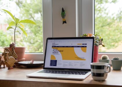
Speed King
You have to make your site as fast as possible. Loading times have to be lowered to be as low as possible. Scientifically backed data shows that each second of loading time turns away multiple percent of visitors. You don’t want that.

Start by looking at the images and seeing whether some of them can’t be compressed. If you have lots of JS elements on the screen, you might want to remove some of them. Sometimes, the server your site is hosted on is really slow and that might be the problem.
Either way, focus on improving loading times and your customer may actually stay long enough to see the home page.
The Fold Matters
The fold is basically the first thing that fits on people’s screens, the fold referring to the lower part of a laptop, where it folds. People really pay attention, or so it seems, to the very first thing that they see on a page. You should make use of that and turn it to your advantage.
Whatever is below the fold will be less important, if the visitor never scrolls down. This is why you should make sure to pay special attention to the design of the fold. Don’t neglect the rest of the design for the sake of the fold. All must be in order, but the area above the fold should really be captivating.
The Hick-Hyman Law
This is one of the simplest concepts that everyone should know. The more choices a person has, the less likely they are to make a choice. This can be turned into a solid design by simplifying it as much as possible, highlighting only a couple of objects or places you want your customer to visit. The fewer choices the better. That way, you can focus on delivering a clear message without scaring your customers away with too many choices.
Simplicity Helps
To continue the train of thought that we started with the Hick-Hyman law, you should keep things simple if you want to attract attention. Glaring elements, vibrant colors, too many things that pollute the screen visually, will distract visitors from the important bits. Too many things can also impact loading times negatively.
Keep things simple, add a few elements that can highlight a certain part of the site and that’s about it.
Scrolling Helps

Modern users require modern solutions. Scrolling is what it is all about. If you can design your site to be a single scrolling experience, then it is going to be better. This is also backed up by data, of course.
Improve your web design with these simple tips. It’s not rocket science, but there are ways to mess up if you’re out of the loop.