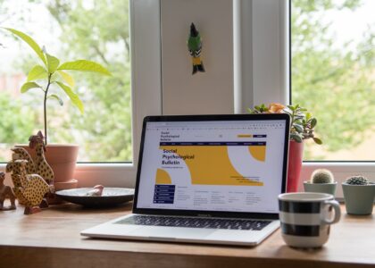
We all know that a good site has what it takes to pull you in and keep you there. We all like sites like those, the ones that have great design, but are also really easy to navigate, intuitive and for the love of everything, a page which is reactive and looks good on mobile.
Desktop pages on mobile hurt everyone, from the user, to the site’s owner to the very developer who forgot to optimize for mobile.
You want to have a great page layout, however, if you are to attract visitors and actually have them stay on your site. Here are some of the best page layouts that will have customers stuck to your site and even returning for more.

The Zig and Zag Method
This is the simplest of methods that you can use and that will instantly make your site more interesting and easier to read. Firstly, your content reads from left to right. Once you are done with what fits on a page, you scroll down to find another well organized page, which also reads left to right.
This way, you can continue the content that you left on the previous page and users will know to look for it on the left side, and down, if there is anything more to be read. This is also good because it makes your site predictable and customers like a site that is easy to understand and intuitive to navigate. This layout will make it so.
The F Method
This is another way that users typically scan websites, in the pattern that resembles the letter F. This method is used largely by stores, with a sidebar on the left, where you can find all sorts of filters, not to mention that you can find content in the middle, which immediately makes the customer want to search and press filter buttons.
This is a standard pattern, but fill your site with beautiful visuals and everyone will be coming back for that simple and easy to use experience, a responsive site which behaves the way you expect it to.
Grid Layouts

This layout method is rather simple, like most of them are. You organize things into clear but grids. The grids will contain information specific to a topic you want your viewers to see. Once they do, they will find a similar experience on the next page, and so on and so forth.
This method makes the site easy to organize and allows you to take some risks with the design, particularly the colors and the images. Since everything is clear and in its place, separated by grids, you can experiment with colors and styles.
Asymmetry Rules
Whenever you have doubts, add some asymmetry to your site. This immediately makes the page interesting, because some things will be highlighted more, while others will be visibly put to the side.
Whatever you choose to highlight, you can do by making it larger. Other things which are important but not as much, can be put next to the large thing, so that they don’t take up so much visual space. Break the rules, but don’t overdo it.
Site layouts are important so try these ones the next time you want to attract customers and have them keep coming back.